The Hub Argentine
View the location on Google Maps
(Visit the mural)
About the Mural
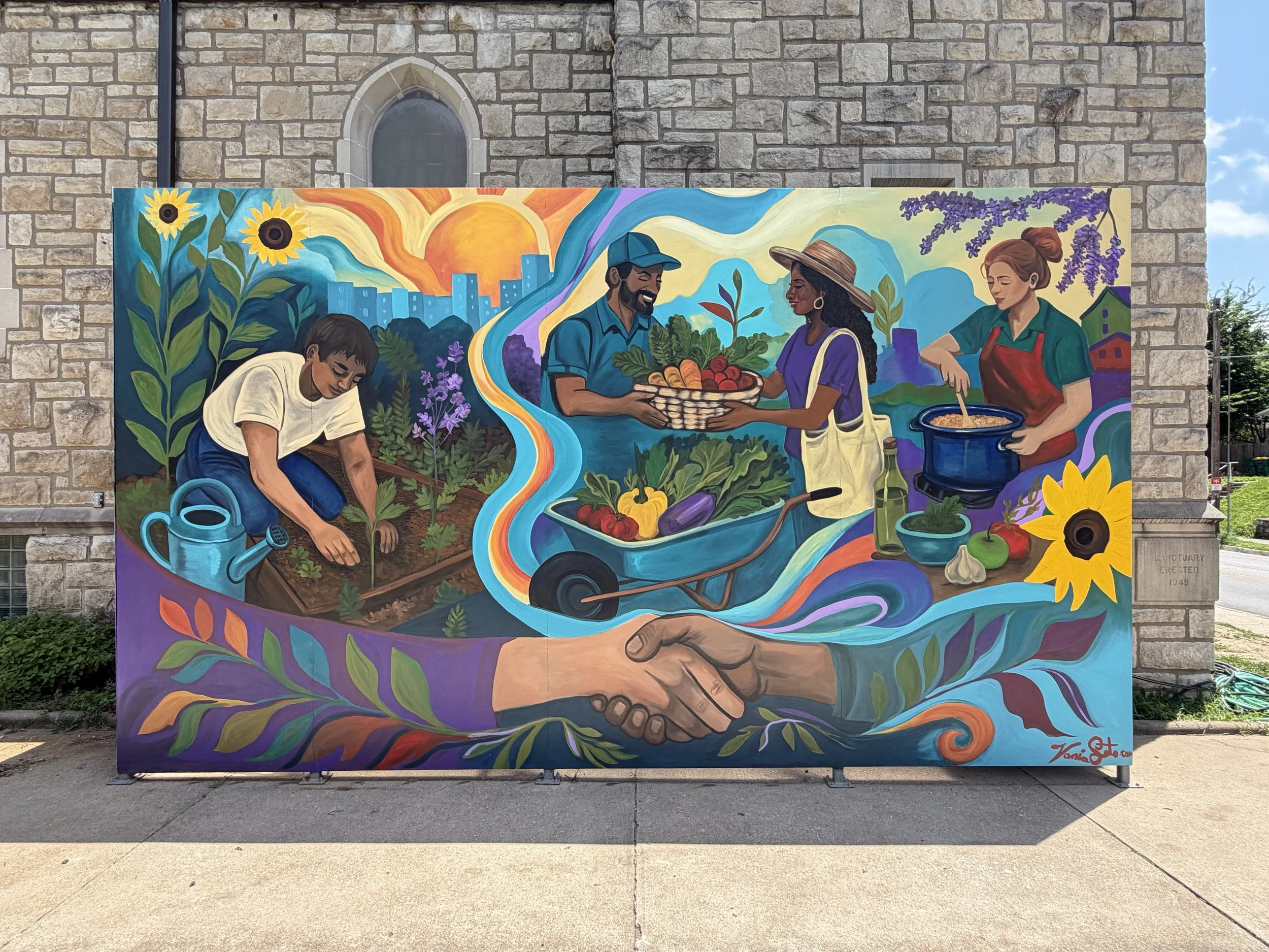
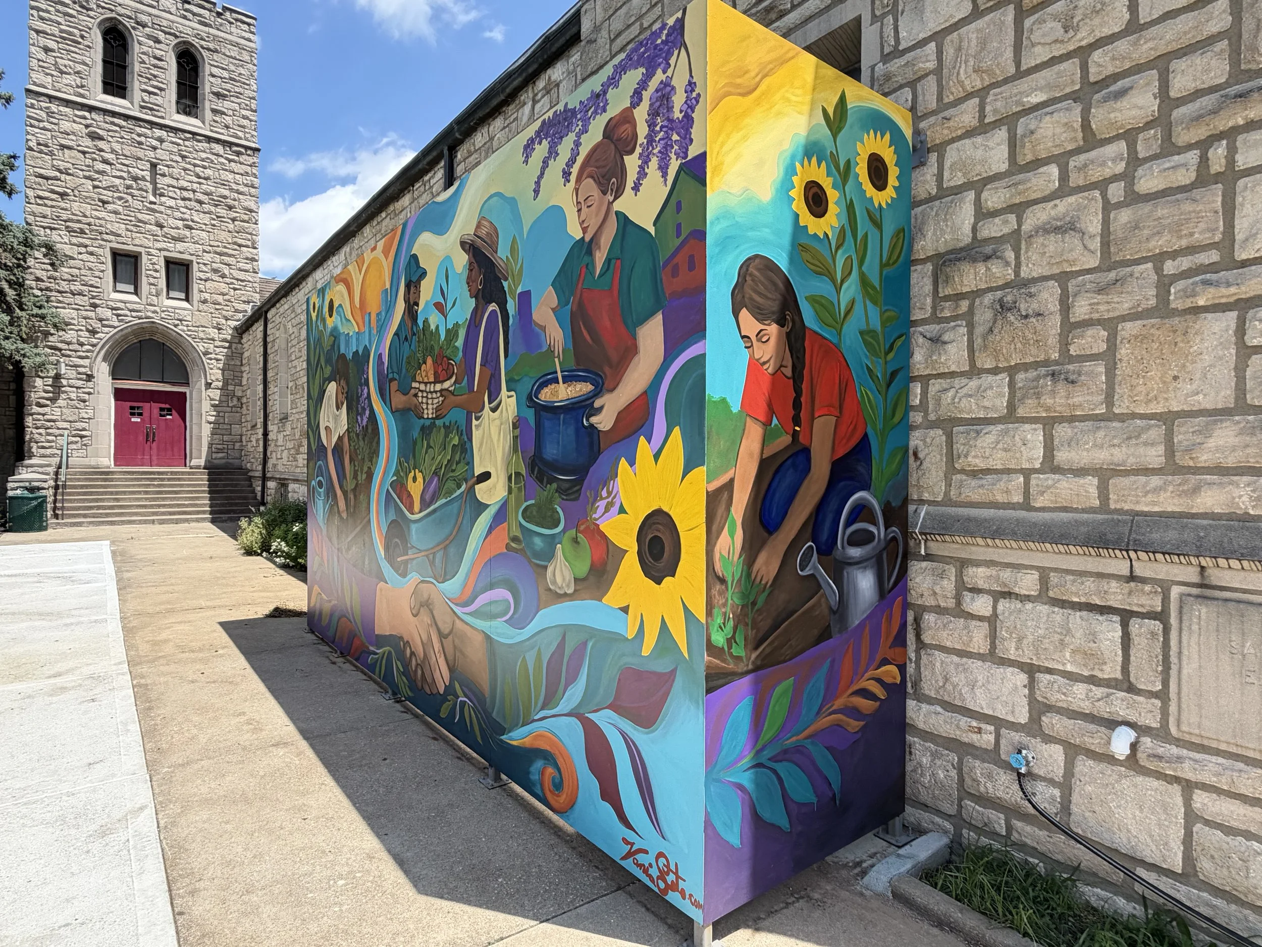
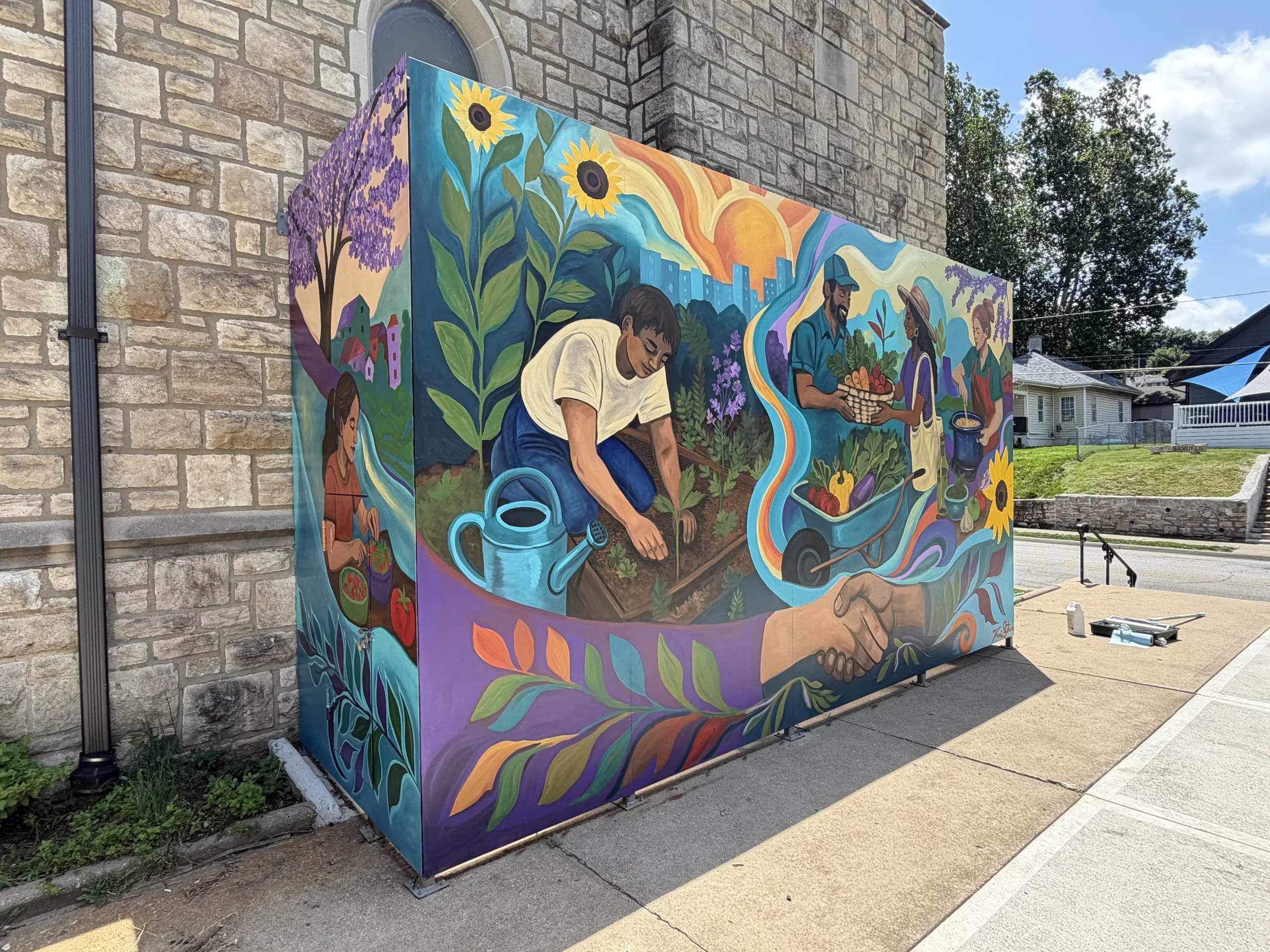
This mural concept was designed to visually reflect the mission, values, and lived experiences of The Hub Argentine community. The artwork focuses on the journey from soil to table, showing how food becomes a bridge toward dignity, belonging, care, and collective community growth. The composition intentionally flows organically rather than separating the mural into rigid sections. This reflects the idea that community-building is ongoing, interconnected, and relational. Each scene transitions naturally into the next through flowing ribbons of color, roots, plants, and movement.
The mural begins with gardening and cultivation, representing care, nourishment, and hope. Raised garden beds, planting gestures, watering, and fresh produce reference the real community garden work taking place at The Hub.
The imagery was inspired by reference photographs shared by the organization while avoiding direct likenesses of identifiable individuals. Toward the center of the composition, neighbors exchange produce in a welcoming and dignified way. The wheelbarrow overflowing with vegetables symbolizes abundance, access, and mutual care rather than transactional exchange. The focus remains on human connection and shared participation. The mural then transitions into food preparation and shared meals, representing the Community Kitchen and the power of gathering together.
The figures are intentionally multigenerational and culturally diverse, emphasizing belonging and relationship across different backgrounds and experiences. At the bottom of the mural, two hands clasp together as a central symbol of solidarity, trust, partnership, and community connection. These hands ground the mural emotionally and visually, reinforcing the idea that strong communities are built through relationships.
The selected color palette incorporates the vibrant colors requested by The Hub, including turquoise, purple, orange, and green. The brighter turquoise tones bring energy, openness, and warmth to the mural while balancing the earthy tones of soil and plants. The overall palette was designed to feel joyful, welcoming, and alive.
The visual style intentionally resembles a hand-painted mural rather than a digital illustration. Textured brushstrokes, layered color application, and simplified forms help the design feel more human, approachable, and timeless within a public community space.
Overall, this mural was designed not simply as decoration, but as a reflection of the people, relationships, labor, nourishment, and hope that already exist within The Hub Argentine community.